When every square foot counts—stop guessing and start mapping your wins.
Why the grid matters
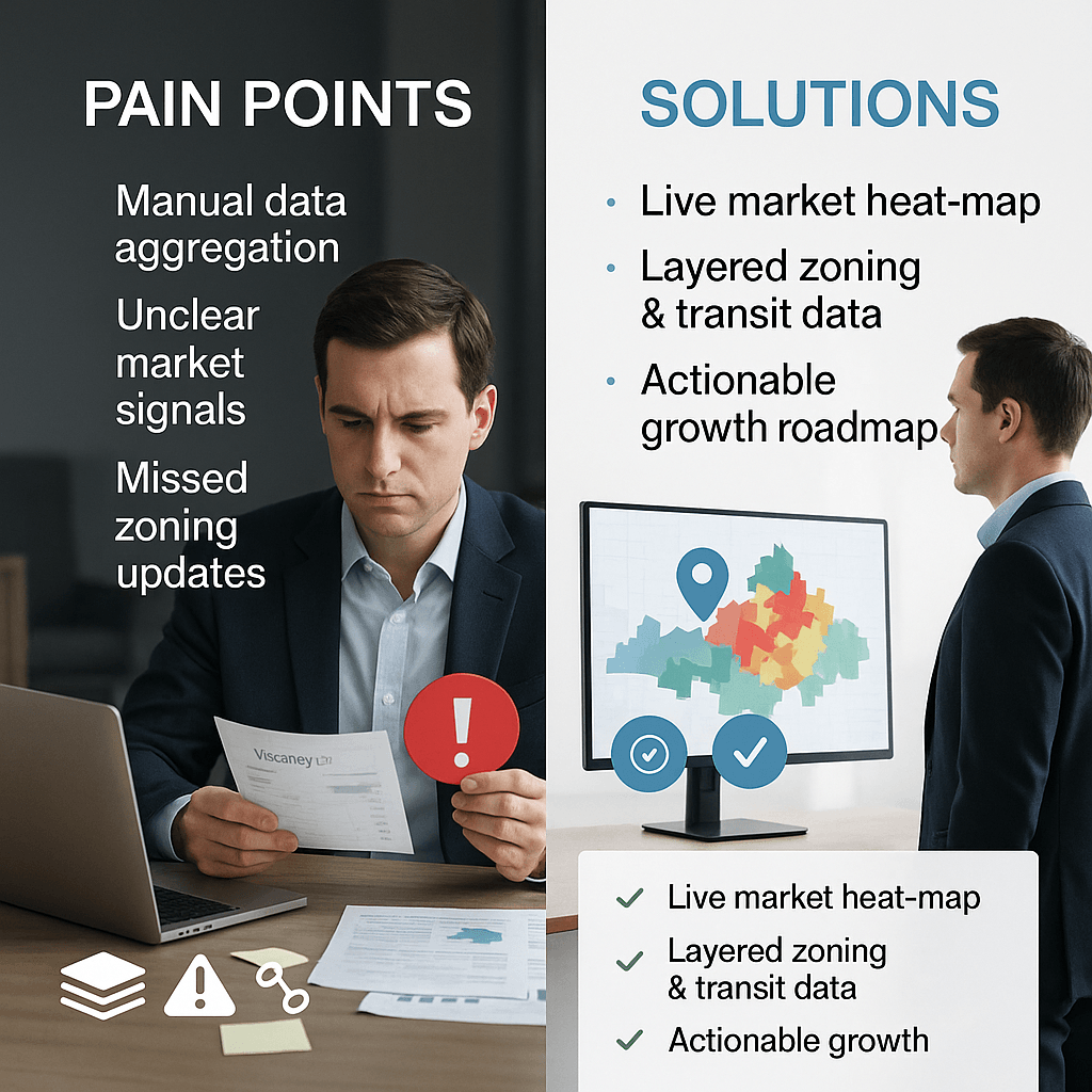
A real‑estate heat map gives you a visual pulse of the market. You can see at a glance where properties are appreciating, where rents are falling, and where new infrastructure turns a quiet corner into a hotspot.
Spot the winners in minutes
- Overlay market data on a city map.
- Add layers for vacancy rates, average rent, and projected transit upgrades. The resulting colors instantly reveal which zones are heating up and which may be cooling.
Example: A developer in Dubai’s Al Garhoud area used this approach and shifted 30 % of its project focus to neighborhoods with rising walk‑score and upcoming metro expansions—boosting NOI by 12 % within the first year.
Avoid the hidden traps
- Layer zoning regulations, land‑use changes, and planned roadworks. You’ll see why a property just outside a new free‑zone boundary loses its leasehold appeal, even if its unit price looks attractive today.
Example: A property in Sharjah that appeared undervalued slipped in value once the municipality announced a flood‑risk mitigation plan for the area.
Turn insights into action
- Flag the top 3 growth corridors.
- Allocate budget for targeted acquisitions.
- Re‑price or re‑market properties in red‑zone areas.
Seeing the grid in action turns guesswork into data‑driven strategy, saving you time, capital, and risk.
Interested in building your own automated real‑estate dashboard that scours market, zoning, and infrastructure data in real time? Visit aiingo.com for a tailored solution.